LoLa and Animal Attraction

Hi! I haven’t posted in a long time. This is not good. I will try to be better. Meanwhile, I have a couple events this week.

On September 19th and 20th, I will be at the LoLa, the Longfellow Art Crawl at Forage Modern Workshop for the third year in a row. I love Forage, and am excited for a fall LoLa. It goes from 10-5 both days.

I also have two pieces in an upcoming show at Gallery 427 in the Northrop King Building, Animal Attraction. It starts with a reception Friday, September 18th and will be open September 19th ,26th, and October 3 from noon to 4pm. The gallery is also open for “First Thursdays” on October 1 from 5 to 9 pm. Check it out!

This guy probably won’t show up, but you should!


18201570400_b33366e13b_z

The Wonders of Technology, Part II; Art Fair Season!

I am so excited to say that I have been accepted to my first outdoor art fairs this summer!

The first was Art in the Park in Eden Prairie May 18th. It was great practice, being my first ever. I learned a lot and am already working on new equipment for my tent. Here was my set up:

booth

I have a lot of ideas to improve for my upcoming shows, including hanging more originals and making a nice table cloth!

The next fair I will be in is the Art at St.Kate’s show on July 13th, 2013.

My third and largest is the Loring Park Art Festival August 3rd and 4th.

Then of course I am participating in the LoLa Art Crawl for my third year in a row August 24th and 25th.

I am honored and a little nervous to be accepted into these shows. I have been working on some smaller original pieces just for the fairs. I have quite a few originals available, but they are all large and therefore expensive. Each one of my signature large pieces takes anywhere from weeks to months to make, while these smaller pieces take three days to a week to complete.

On the other hand, I am also happy to make prints of my larger artworks. I love my Epson giclee printer. It makes very accurate, saturated images that will last for 100 years and more. They are so great looking that I mistook a framed print for an original, and it’s my own work!

It disappoints me when in my extensive research on how to approach an art fair that many artists do not like prints. Many artists say they HATE prints, that they undermine their work. I am confused. I think it’s really fun to see everyone who truly likes an art piece be able to have a copy of that artwork. Not everyone can afford an original that has taken so much time to complete.

I don’t feel like a giclee print undermines the original. They are two different things. My original works have different textures a scanner could never see. The pencil strokes are all there. The finished piece is an object that the artist has spent hours and hours with intimately and basically just cannot be reproduced. Therefore, a print of the work is no threat. Sure giclees are great at reproduction, but there are sensations of three-dimension and of textures that simply can not be scanned. You can’t scan the smell of an oil painting and the softness of each particle of pastel will never show through on a print.

I will never do a “limited edition” giclee; my prints are all open editions. Setting an arbitrary number to print goes against my traditional hand-pulled printmaking background. So are giclees worth buying, then? What is their value if they can be unlimited? Their value is that they are a piece of art that you love whose colors will last longer than you will. They are a piece of art that makes you happy, and isn’t that a great reason to have a piece of art?

The Wonders of Technology, Part I

I love technology and I love using it in my art. My current work usually begins with a digital photograph or two and then correcting and tweaking in Photoshop before it gets put on paper. I use my Photoshopped reference as a guide while I do the actual drawing. The finished product is a blend of reality, photograph and my own art filters.

There still seems to be a bit of a stigma attached to using tech to make fine art. When you don’t paint or draw from life; if you use a photo, certain people devalue the finished product. I have had one fine art photographer get very defensive about using technology without even being asked. He told me “People ask me ‘How do you get such bright colors, is that Photoshopped?’ I say it’s none of your business!”

Yikes. That told me not only is he using Photoshop (It was pretty obvious anyway) but he doesn’t want to admit it to customers. It’s seen as somehow you cheated or worked less on the art piece.

I think people should be proud of using Photoshop. After all, it is a valuable learned skill, and not everyone can use the program effectively. I still fell as though I have more to learn than I know and I use the program every day at my day job.

I’ve been working on my latest piece “A Love Story” for about a month. Photoshop just really saved me some heartache on it, and here is how.

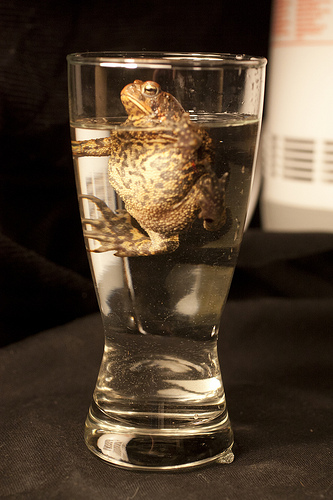
This drawing began with two reference photos. A toad in a glass of water and a rose in an empty beer bottle. I couldn’t leave a toad in a glass of water for the 20-30 hours this piece took to finish so I photographed it. Poorly, I think. He’s partly out of focus. I adjusted the toad’s head size to be larger and elongated the glass in Photoshop for a better composition. Because I don’t know if soaking in beer is good for amphibians who absorb things through their skin, I went in and added a yellow tint to the liquid to beer-ify it instead of plunking a toad into a beer. The photo itself was very lopsided and needed more to be any kind of art. Years later, I used a dummy glass and set up a beer bottle still life so I would know where best to merge the two photos. I put them together and adjusted the composition. Thanks, Photoshop.

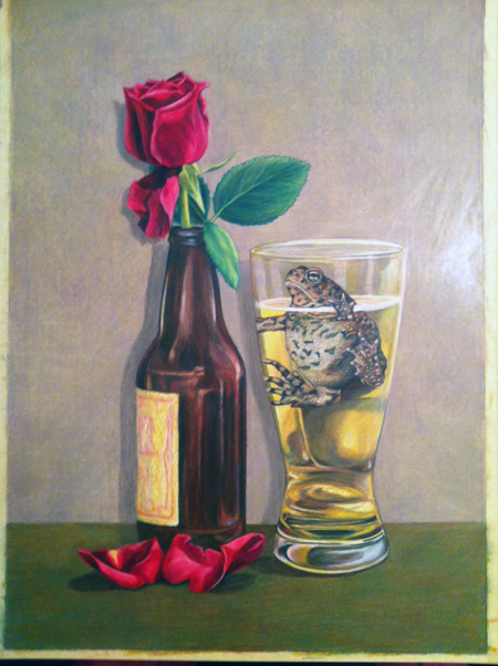
Jump to me being almost finished with the drawing. IĀ  had worked on this a couple hours a night every other day or so for a month. I had applied several layers to the background and was not satisfied with the color or the effect it was having. I had this:

lightbg

It didn’t feel right, but the layers of background were getting so thick I couldn’t make another color “mistake” without having to erase the entire background – a daunting task on a 13×19″ drawing. The tooth of the paper; the part that will take pigment from colored pencil was 90% full. So I took the above photo on my iPhone and brought it into Photoshop to play around. I came up with this:

shopped

I darkened the background and ground. I wrote myself some notes to add red to the leaves, make the toad’s footpads a little lighter and work on the beer bottle. I went back to work on the drawing. It was tough to add another layer to the saturated background but I did it with the help of an old t-shirt and my finger to blend the new layer. It actually earned me a blister on my pointer finger.

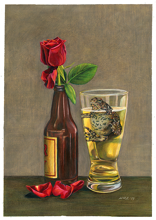
The “finished” product:

lovestorysm

It really is a subtle difference, but if I had done this next layer in a color that didn’t work it would have easily added another 4 hours to this piece, and one wrong erasure could mean death for the rose or bottle.

Here is a before and after. Proof that a little can go a long way:

lightbglovestorysm

Finishing touches include the bottle label, adding some orange to the rose and darkening the background inside the beer glass. Phew! The smoothness of the Photoshop mockup was lost long ago when I pressed too hard on the background and bottom of the drawing. Next time I’ll go a little easier on the paper now that I know my newest drawing board is a little soft.

I see a couple things I don’t like now. Seeing it smaller on the computer amplifies things I might not see in real life. The middle bottle reflection has to go. There is a distracting unevenness in the ground near the flower petal. The right side of the glass could be less lumpy. The rightmost highlight on the glass needs a little evening up where the “beer” is.

Thanks, Photoshop. It will never be “perfect,” but I let go of perfection a long time ago. The role of technology in my work isn’t to make something exactly like a photograph, but something better than a photograph.

Here is how this one began; an idea poorly captured in my living room before releasing this model back into the wild. I think I made this drawing better than the photo, and I hope you do too.

5794386560_c72448b95b

New Piece and Good News

Yesterday as I left work, a chorus of hundreds of voices greeted me. No, I’m not going crazy; it was the toads! They were calling loud and clear in the swamp across the street. The males call out to the ladies in spring. It’s a meat market over there! Fascinated by all things toad, their mating is one of the more interesting and intense things about them. The males mob the females, vying for a chance at fertilizing her eggs. The sound makes me a little twitchy; ready to grab my camera and catch a glimpse of their fascinating behavior. Maybe I am crazy!

Anyway, I clearly am still enamored with bufo americanus, even if I haven’t been drawing all that much lately. I did finish a small piece just to get it out of my head. “Little Black Dress” is a toad in a little black dress. When people talk about that iconic piece of wardrobe that every woman NEEDS in their closet, I envision myself looking like this gal. They don’t make a little black dress for me, if you know what I mean! šŸ™‚ So here is my toad in her LBD, looking less than thrilled about it.Ā  You can buy prints of her in my Etsy shop.

Little Black Dress

This is my first drawing done 100% with Caran d’Ache Luminance pencils. These pencils are expensive but proven lightfast and do not have the breakage problems of Prismacolor pencils. They are worth the extra cost for that reason alone; I have never had one sharpen poorly or lead snap at all. I get down and dirty with my pencils and press hard, so a lead that can withstand the pressure is great.

My other good news that isn’t that the toads are back is that my piece “The Wrong One” was selected to be in the Colored Pencil Society of America’s 20th International Expo! It is in Covington, Kentucky which is in the greater Cincinnati area. We are planning on visiting the Artist’s Reception in August. I can’t wait to see all of the colored pencil works up close and examine the techniques and finishes used by the best colored pencil artists in the world.Ā  They look so smooth on the internet; it is tough to get a read on what the finish of a colored pencil piece looks like.

It is a great honor to have been juried in to this show. It consistently has amazing work. I’m so excited I could sing!

The Wrong One

“The Wrong One” is the working title for this piece that I hope to enter in Prismacolor’s art contest. I was able to start it the other night. Looking at all of the other entries; this is going to be tough. I have about four hours into this piece so far. The .gif shows the process I take pretty well. The last frame shows where I am now. This is the part where I start losing confidence that the background is going to turn out all right. I have begun burnishing the light spots in the background with Prismacolor’s Cream.Ā  Over the cream color, I can add back both light highlights and darker green.

I plan on finishing the background about 90% before moving on to the hand and toad. I think that will take three or four more evenings of work. It feels really good to be getting back into a drawing. Stay tuned to see if I mess it up!